Wednesday 24 April 2013

evaluation 2

How effective is the combination of  your main product and ancillary texts

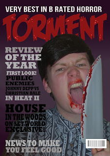
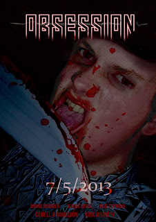
I feel the three texts work well together due to the nature of them, online video sharing sites such as YouTube and film websites could share the trailer to promote the film were as the poster and magazine cover are more physical ways of promoting the film, posters being able to be shared anywhere and magazines going directly to the targeted audience.

I used a combination of film trailer, poster and magazine cover to advertise the film. This is pretty standard among many theatrical releases and even more underground movies. The Poster was made to look mysterious and curious. The use of the model supposedly licking a bloody knife gives off a rather shocking feel and this is intended to stay in the memories of the audience, i wanted to keep the same theme for the magazine cover as it helps them to seem as a collective, Also repetition is a proven way to have an impact on someone. Due to the two visual texts being quite vague it helps to stay open to a wider audience as opposed to a more niche one, which was one of my intentions.  one of the subtle things I done on the poster was the choice of shirt worn by the antagonist faded into the background and gives off an almost hypnotic feel due to the pattern.
Evaluation 1

In what way does your media product use,develop or challenge forms and conventions of real media products?

We decided not to challenge any conventions of horror as it may give the trailer the wrong feel or not work very well, sticking to established conventions helped us produce a solid trailer. 

when planning and filming the trailer we made sure to use shots which are conventional of the horror genre. This was one of our main priorities as it would make clear to the viewer what the genre is. Alongside this we made use of other techniques such as juxtapositions of pace and the build up of tension. One of the more subtle techniques we used to achieve this was the slow increase of tempo of the beat in the background until we reach the main climax of the trailer. Another generic feature used was having text interrupt the narrative of the trailer to make it more disjointed. We discovered we needed to do this after realizing that the trailer was to sequential and linear. we added multiple "random" shots and scenes to jumble up the story. 
Trailers being messy and not following narrative is important as it helps give a taste of the film without giving away the plot.

The characters played were intended to be ordinary teens to appeal to the target audience, this is all to common in allot of horror films. The main antagonist is specifically made to seem ordinary, this makes the viewers  feel uneasy because he could be any person in real life. An antagonist that seems so close to reality can be just as effective as a scarier one in some scenarios. This is similar to films such as the shining, Horror experimented with using the family as the antagonist during the 60s and 70s, this era was one of the main influences to our trailer.

Monday 15 April 2013

representation of women in horror

Throughout horror film history Women have been given similar roles and been portrayed in a certain way. Frequently this role is passive as opposed to the active role of males, whom are often saving these girls from danger. These female characters are often attractive and young. This became even more obvious in the nineteen sixties and seventies due to the sexual revolution and the relaxation of censorship laws that subsequently happened. This idea however is evident, even in the early silent horrors where shots of females screaming helplessly were common.
  Post nineteen sixties, women were represented with less clothing and were allot more provocative. Historically major changes in society have always caused moral panics and this was no exception. Many film makers began to portray these women very negatively. Many times, women in horror films are killed for taking part in sexual activities or for drug use and so on, anyone that would oppose conservative America would meet a bad fate.

Carol J. Clover coined the famous term “final girl”, referring to the last female character at the end of a horror film who either survives or defeats the “killer”, whatever it may be. Although this character was female, she often undertook more male traits and may have a unisex name.


Props/costume list.

The props that I am planning to use are as follows.
·        Fake knife
·        Fake blood
·        Unusual Pendant/necklace
·        Torch
·        Face makeup

The costumes will be stereotypical teenage clothing, to make the viewer’s connect to the actors. Even the killer will be wearing clothes that are not completely out of the ordinary as it makes the deranged character seem normal at first glance. Although the clothes should be unique so that he/she is recognisable.


Recce report

I have planned to use an ordinary house as I feel It gives it a sense of possibility that what happens in the film, could happen anywhere, to anyone. Also the house that we have chosen has a basement which could work well as it is a generic location in relation to horror films.
The second location I am using is the beach as it ties in with the narrative of our film’ the pendant is thrown out to sea and a group of teenagers find this pendant washed ashore.
The last location will be a forest or wooded area, I want the shade of the tree to make the scene look dark and also to cast shadows across the actors faces.
Other possible locations could be general streets and roads to act as fillers when the pace of the trailer increases near the end. Short shots that mix up the narrative of the trailer are common within film trailers.